

Here is my version of the Yolland Bresson Module which follows the Galileo Module.
As the data has already been gathered in the last part of the Galileo Module, we can switch directly to part (b) and create the charts. Note that I based most of my data on the spreadsheet by Inso. I’ve added to it most of the data since 2014 until 2019.
(b) Create Relative Charts
In the Galileo module, I have already discussed the price of gold over time especially compared to different currencies and even compared to real estate prices in Paris.
The Gold Standard effect
One very interesting graph is the long term one which compares the USD to gold:
 This is an unusual graph in which we observe the purchasing power of the USD compared to gold. The two steps of the gold standard, before and after 1929, are clearly visible. Then in 1971 as Nixon breaks the gold standard, the fall of the dollar compared to gold. One could say that, by forcing the gold standard, officials have tried the impossible: forcing one value to be equal to another one, although those values were appreciated quite differently in people’s minds.
The point here is that we can always compare any value to any other value, and no value stays equivalent to another one over time.
Looking from another perspective
We always look at prices “in euros” or “in dollars” but we never compare random values together, such as real estate and welfare.
So let’s do this just now and draw the chart of real estate prices expressed in units of welfare!
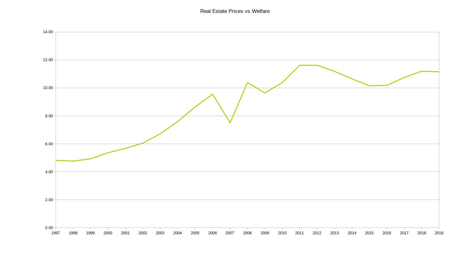 We’ve seen in the Galileo module that if you own gold, then the price of a flat is actually going down since the 1990s. But if you’re on welfare, the price has more than doubled in the same period of time.
(c) Charts
The point of this part is to look at prices not only over time, but also across geographical regions. Cuckooland has done a tremendous job which allows to see the prices of real estate change over time as the raise in price clearly starts in the center of the Capital, and diffuses first to the West (the richest suburbs) then to the rest of the area. Play with it, it is excellent! He has also rewritten some of it into a new app which he even translated to English. It is also available as a block. Enjoy!
Real Estate around the World
This is all about Paris. But what about the rest of the world? Are real estate prices all going up? You can download the spreadsheet real-estate-world.
Here is a chart of real estate prices worldwide since the early nineties, gathered from the IMF.
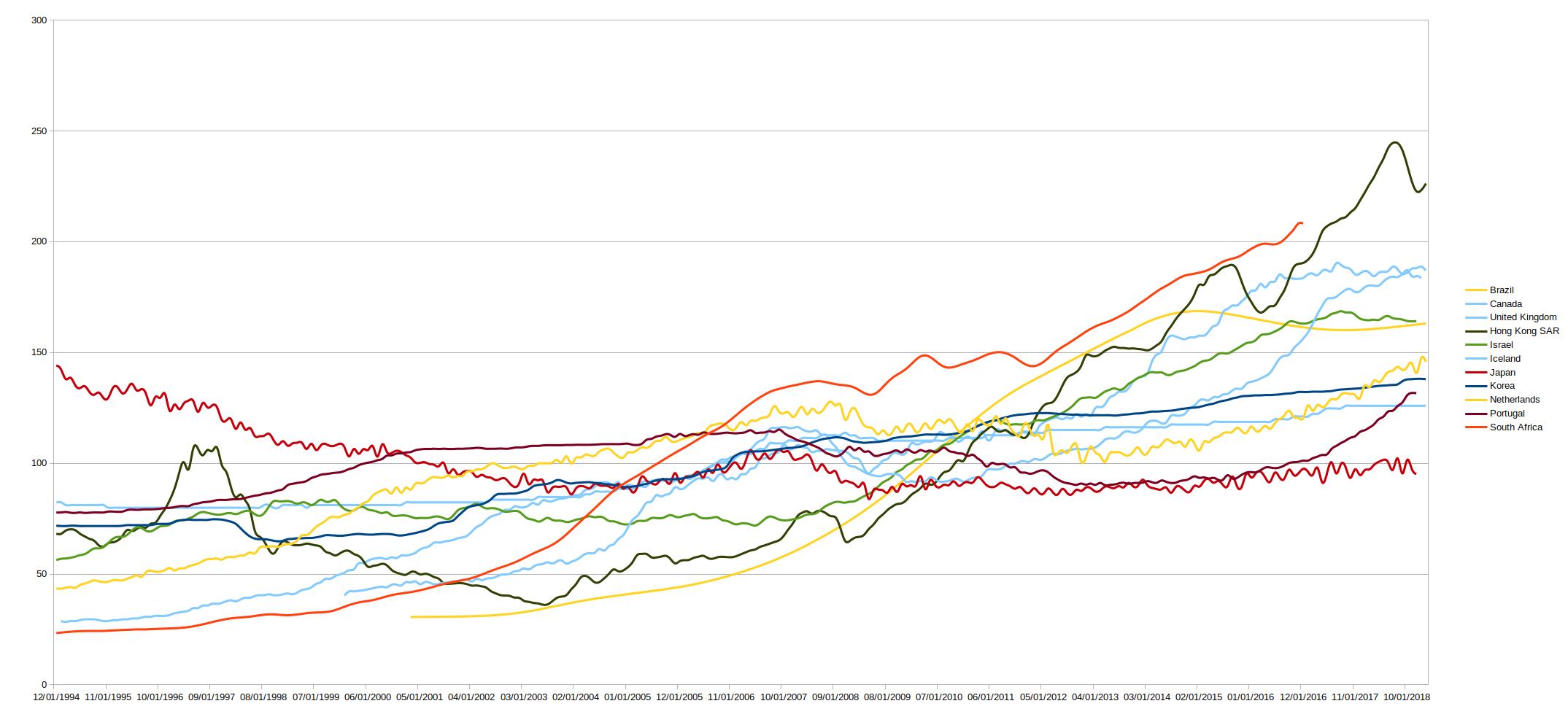 Obviously, some prices are going up, but some others are going down!
The geographical changes are also not uniform at all. For instance, in the UK, the prices between the London area and the rest of the UK are absolutely not following the same trend:
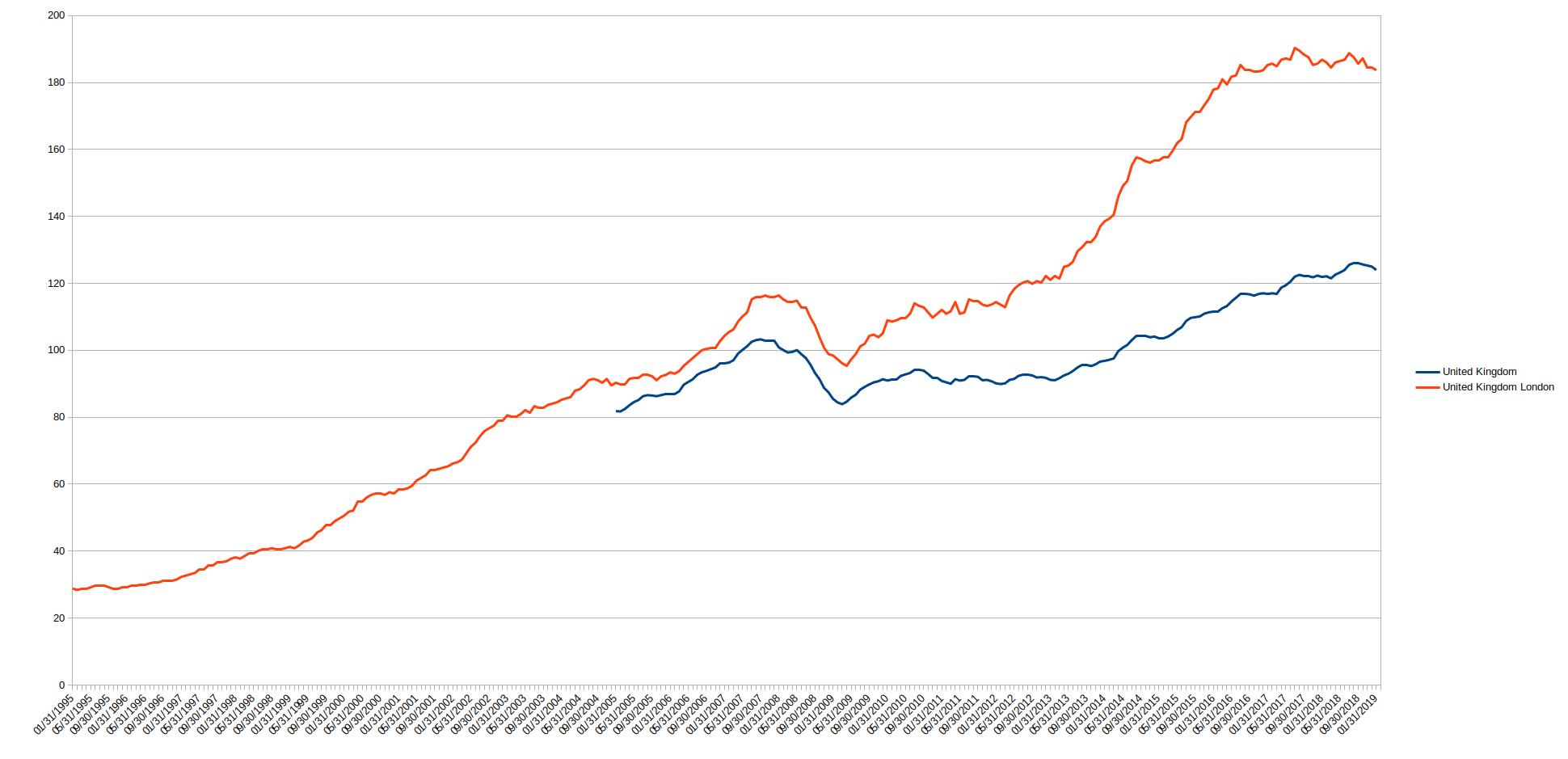
While London prices are skyrocketing, doubling between 2005 and 2019, prices elsewhere are not that crazy.
Wheat prices in the US
There are many other interesting values to be considered when it comes to geographical differences.
You may think that prices of wheat, for instance, are pretty much the same everywhere. Well, they are definitely not. The spreadsheet for this is available for download wheat-us. Here is a chart of wheat prices in the US over time:
 From Denver to Portland, there has been a point in 2017 when you would pay double the price of wheat in Portland compared to Denver. I’m no expert in wheat crops in the US, but obviously Denver is a big producing area while Portland is not as big.
One other apparent trend here is that prices have diverged during mid 2016 and are getting closer again at the beginning of 2018. Many factors can explain this, such as a bad harvest which is actually confirmed for 2016. When the area already produces very little, a bad harvest means you may even need to import some wheat from elsewhere. But for a big producer, it has less impact. Although it may affect your exports, you still have more than enough locally.
Now that we know that we can actually compare any value with any other, we can actually compare the wheat price in Portland to the Denver price and create the corresponding chart:
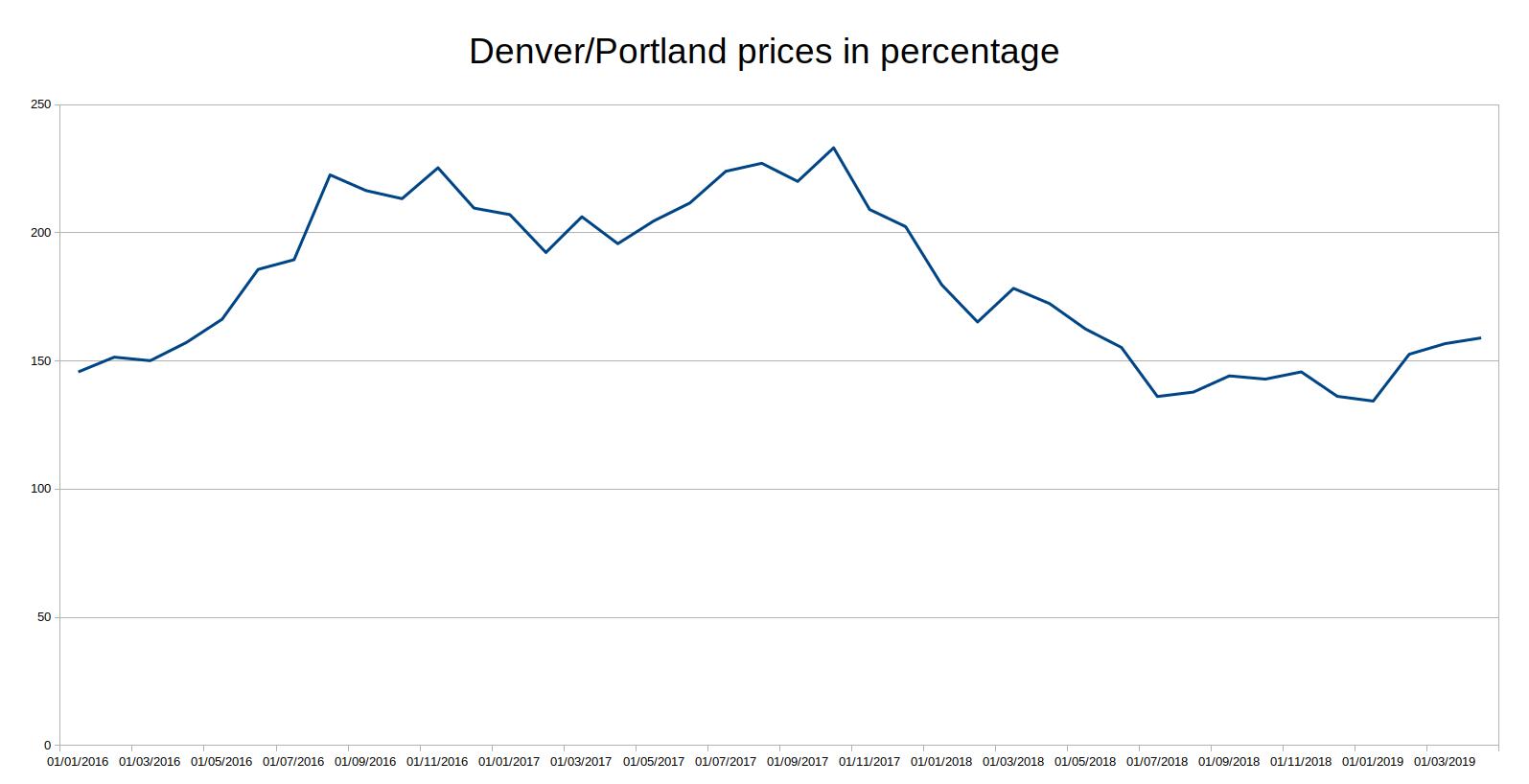
We see here that Portland paid an immediate toll for the bad harvest in 2016 and only recovered in mid 2018, 2 years later.
Conclusion
Every value evolves with time, but also in space, always relative to other values. Many factors drive these changes: geography, climate, natural resources, social bias and trends of values in society, individual preferences, etc.
That’s it for Part 1, I will continue in part 2.
One thought on “My Yolland Bresson Module – Part 1”
Comments are closed.